
The Current Output Gap
It's one reason inflation is high

The CPI rate of inflation from December showed prices increasing by almost 5 percent on an annualized basis. Granted, an annualized number is a hypothetical number, but that his still alarming.1 Last week, Macrosight dove into inflation’s stubborn refusal to fall back to 2 percent. As a follow up, it is natural to ask, “what is fueling that stubbornness?”
While three (or even two) to four years ago there was talk of supply-chain constraints, Covid-19 and what have you, currently the “output gap” is the likely culprit.2
Inflation Expectations, Shocks, & Output Gaps, Oh My! (The Remix)
Back in the “good ole’ days” of early 2022—when the CPI rate of inflation was still a few months away from peaking at 9 percent (see Figure 1 in this post for this history), Macrosight broke down the macro drivers of inflation, summarized in this pretty picture:

Back in 2022, all three of those factors were in play. GDP growth in 2021 was historic; inflation expectations were rising; and the “shocks” part was also still a factor (in the form of lingering supply-chain constraints; see more on “shocks” here).
Now, only the last factor has largely vanished from the scene (are there any supply-chain constraints still lingering four to five years on? Probably not). While inflation expectations have been relatively stable (discussed in this post), they are still currently around 2.6 percent.3
Just as important, the output gap has been persistently positive.
The Output Gap
The Output Gap is a relatively simple macroeconomics concept. It is defined as follows:
Output Gap = Current rate of real GDP growth – Long run average
The current, best estimate of the “long run average” is the Fed’s estimate of 1.8 percent (per the Fed’s forecast, explained here). Hence, we can estimate the output gap using that estimate and whatever the recent values of real GDP growth have been. Table 1 shows the results of this simple formula for each quarter since 2023.
The output gap is a representation the business cycle—which is simply the oscillations of real GDP around the long run average (discussed in detail by Macrosight here).
With respect to inflation, the following rule-of-thumb applies:
When the output gap is positive, the rate of inflation increases.
When the output gap is negative, the rate of inflation decreases.
How do we make use of this rule-of-thumb to understand recent inflation?
Predicted Inflation and the Output Gap
The rule-of-thumb is typically formalized in the following linear equation:

This representation—re-printed from this Macrosight post—is a simplified or baseline version of equations macroeconomic researchers would use for inflation-related analysis.4
Using this equation, we can estimate what inflation would be given values of inflation expectations, the output gap, and shocks. The latter, by definition, are unpredictable. So, let’s ignore that component for now. For the first two, we have data on each.
Table 2 reveals the result of plugging in the expectations data (from here) and the output gap data (from Table 1) and compares the quarterly results of that prediction to actual CPI inflation over the same period.
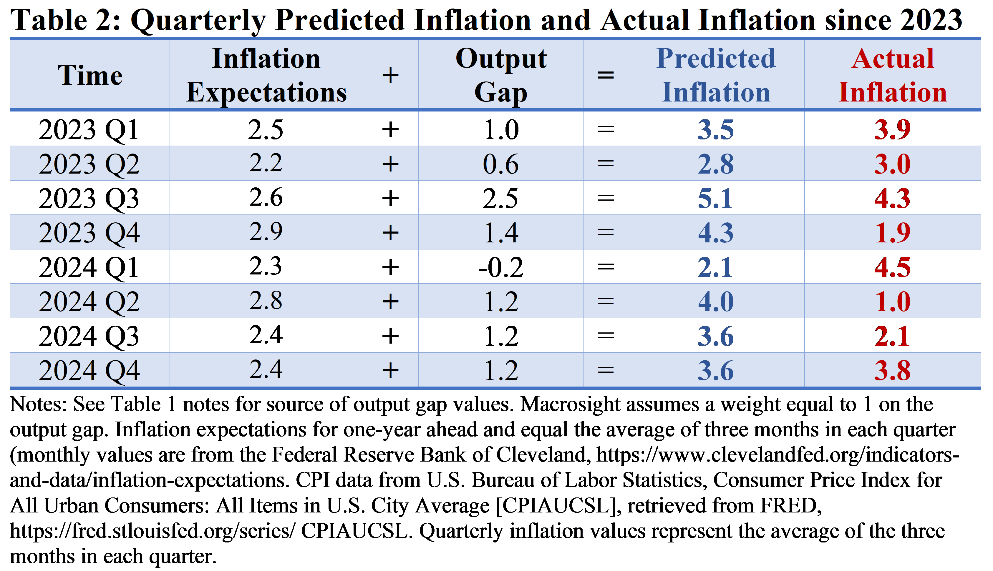
The simple idea is that since the output gap has been mostly positive the past two years, we would expect inflation to be higher than “normal.” Inflation expectations, in fact, represent that normal. If the output gap was zero, then actual inflation should equal inflation expectations (save for random shocks).
As displayed in Table 2, the simple inflation equation does an okay job of predicting inflation the past couple years—at least for about half of the quarters.
Of course, it is not going to be exact, for at least a couple of reasons:
The simple addition of expectations and the output gap is a very simple way to assess predicted inflation. In practice—say one was writing a master’s thesis or PhD dissertation—one would take greater care to consider different versions of the expectations equation by adding different factors or versions of the factors shown above (I use the one-year-ahead measure of expectations for the purposes of this post, for example). One would also estimate or apply a weight to the output gap (the turtle in my equation above represents that weight). And that represents just a couple of the possibilities (you can see more advanced versions and discussion of the equation here and here).
The difference between predicted inflation and actual CPI inflation shown in Table 2 is also likely driven by “shocks.” For example, just recently egg prices have risen due to a disease wreaking havoc on chickens, leading to a reduction in the supply of chickens and eggs. While eggs represent only one item out of over 80,000 in the CPI basket of consumer goods, such a random event affecting egg production is a good example of the type of “random” shocks economists think of in applying an equation like discussed in this post. Another good example, of course, was the supply-chain issues from 2020 and 2021 related to Covid-19. By their nature, events such as these are unpredictable. We know various events will lead to sudden increases in the price of gasoline, certain foods, or even snow shovels in places like Louisiana this month, we just do not know when those events will occur, nor the magnitude of the impact of those events.5
Lastly, while recent inflation cannot entirely be explained by the output gap, the simple methods employed here at least underscore what this author thinks is an important point: real GDP growth has been above the long-run average, and has been so, on average, for a while now. On the one hand that is a good thing. That means a stable jobs market, rising incomes, and a stable macroeconomy. On the other hand, when macro-variables are above trend—we have positive output gap—that is associated with higher rates of inflation.
The gist of an “annualized” number is as follows: If prices increased at the month-to-month rate recorded for December over 12 months, what would the annual rate of inflation be? The month-to-month rate in December was 0.39; multiplying that number by 12 gives you an annualized number of about 4.7—see footnote #1 from last week’s post for more detail on this issue.
See the latest data on inflation expectations here, https://www.clevelandfed.org/indicators-and-data/inflation-expectations. This is the same data discussed by Macrosight in this November post.
The ins-and-outs of this equation are explained here, along with the picture of the turtle within that equation.
The nature of any forecasting model or equation incorporates this idea. The best information we have for forecasting any variable is the historic and repeated behavior of that variable. That is the best information we have to go on. We know, of course, that randomness has also affected that variable in the past and will do so in the future. But, by its very nature, randomness is unpredictable. Hence, in building a forecast, the known and repeated information serves as the key input in the forecasting model. Thereafter, one necessarily has to employ “scenario analysis” to contemplate the future effect of possible shocks (this theme has been discussed at various times by Macrosight in previous posts, for example, this one).